

TL;DR
A landing page is a single page built around one action. It beats a homepage because it removes distractions and matches the intent of the click. The median page converts at 6.6 percent (Unbounce, Q4 2024), "good" sits near 10 percent, and top performers clear roughly 11 percent.
The fixes with the most evidence behind them: one focused call to action, fewer form fields, faster load, no navigation menu, and social proof near the form. Single-call-to-action pages convert at 13.5 percent versus 10.5 percent for pages with five or more links (Unbounce, vendor-reported).
The best page is the one you tested. Most figures here are directional benchmarks that swing widely by industry and traffic source, so treat them as starting points.
A high-converting landing page is exactly what Zero Dollar Website builds and hosts for you at $0. SEO, marketing, and A/B testing are optional paid add-ons.
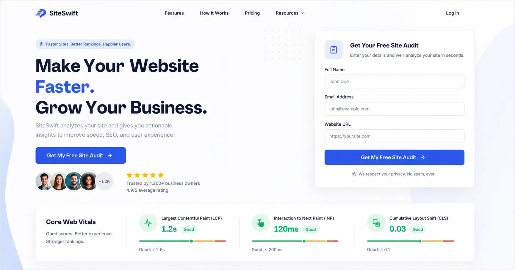
Landing page mockup showing one call to action, a short form, social proof, and Core Web Vitals scores
Most teams spend their budget getting a visitor to click, then lose that visitor between the headline and the form. The page is where the money leaks, and most of the fixes are free to apply. At Zero Dollar Website we build and host your done-for-you website for $0, and the page we ship follows the principles below. If you later want help with the traffic and testing, our marketing and local SEO services are optional.
What a landing page is, and why it beats a homepage
A landing page is a standalone page built for one marketing goal, the place a visitor lands after clicking an ad, an email link, or a search result. A homepage tries to serve everyone and is wrapped in navigation. A landing page has one job: turn the visitor into a lead through a form, signup, quote request, or call. It wins for three reasons: it carries one goal, its message matches the promise that drove the click, and it strips out the menus that pull attention elsewhere.
HubSpot's research agrees at the portfolio level: businesses running 40 or more landing pages generate far more leads than those running a handful, because more targeted pages mean more chances to match the right offer to the right person. You do not need 40 to start, just one page that respects the visitor's intent. Whether that page is best served by a lightweight web app or a native build is a separate question we cover in our guide to PWA versus native apps for small business.
Conversion benchmarks are ranges, not targets
The cross-industry median is 6.6 percent, per the Unbounce Conversion Benchmark Report (Q4 2024, from 464 million visits across 41,000 pages, vendor-reported). Unbounce uses the median so outliers do not skew it.
Industry swings are large. Unbounce puts SaaS near 3.8 percent and events and entertainment around 12.3 percent, with finance near 8.4 percent (vendor-reported). "Good" is roughly 10 percent or higher, and the top tenth of pages convert at about 11.45 percent or more.
A lower figure you will also see. WordStream cites a cross-industry average closer to 2.35 percent, but that number folds in every page type, not just optimized landing pages.
Traffic source matters more than industry. Unbounce found email converts highest, near 19.3 percent, with paid social around 12 percent and paid search near 10.9 percent (vendor-reported). Segment by source before you compare yourself to anyone.
The only fair comparison is your own page type, offer, and traffic source.
The anatomy of a page that converts
Wireframe of a landing page hero with headline, subheadline, one button, and a row of three customer logos below the fold
A headline that names the benefit
The headline is the first and sometimes the only thing a visitor reads. David Ogilvy put it bluntly: on average five times as many people read the headline as read the body. Lead with the outcome, not the feature. "Save ten hours a week on reporting" beats "AI-powered analytics dashboard."
One goal, and a message that matches the click
Each campaign should carry a single goal, and the page's language needs to echo the ad or email that drove the visit. When they do not match, bounce rates climb and ad spend evaporates. This is the most underrated lever, because a mismatch loses the visitor before anything else gets a chance.
A clear, single call to action
One beats many. Pages with a single call to action convert at 13.5 percent against 10.5 percent for pages with five or more links (Unbounce, 18,639 pages, vendor-reported). Aim for one link per goal.
Words matter more than color. In one Unbounce and ContentVerve test, switching "Start your free trial" to "Start my free trial" lifted clicks 90 percent (case study, directional). First-person, benefit-focused copy tends to win. Try "Get my free quote."
Color is really about contrast. The exact shade matters less than standing out.
Placement. Put it above the fold and repeat it at sensible scroll points.
Personalization. HubSpot reviewed more than 330,000 calls to action and reported personalized versions converting 202 percent better than basic ones (vendor-reported on its own properties, so directional).
Hero, visuals, and scannable copy
People scan in an F-shaped pattern, a finding from Nielsen Norman Group eye-tracking work confirmed again in 2017. Use whitespace and quiet directional cues to steer the eye toward the form, and skip generic stock imagery: one truck driving school saw a 161 percent jump in form submissions after swapping a stock photo for a picture of a real student (VWO case study, directional). Lead with benefits and use bullets. Unbounce found pages written at a fifth-to-seventh-grade level converted at a median of 11.1 percent, double the 5.3 percent for college-level copy (vendor-reported).
Social proof and trust signals near the decision
Testimonials, reviews, client logos, and concrete numbers build credibility. Adding three lines of testimonial lifted conversions 34 percent in the VWO and WikiJob test (case study, directional), and BrightLocal's Local Consumer Review Survey reports that 97 percent of consumers still lean on reviews. Place specific, attributed proof within one scroll of the call to action. Trust signals like security badges and a privacy note belong beside the form, where doubt spikes. A Blue Fountain Media test found a VeriSign badge near a form lifted conversions 42 percent (case study, directional), though badge effects vary, so validate. See real outcomes in our case studies.
A lead form that asks for less, and no navigation
Fewer fields usually convert better. Cutting a form from 11 fields to 4 lifted conversions roughly 120 percent in the widely cited Imaginary Landscape case (directional), and HubSpot's analysis of 40,000-plus forms shows the same downward slope. The honest caveat from CXL is that sometimes an extra field qualifies a lead better, so the right count is the one your test confirms. Removing the navigation menu doubled conversions, from 3 percent to 6 percent, in the VWO and Yuppiechef case (directional). Keep the visitor pointed at the one action, and use urgency only when it is genuine.
Speed is the lever most teams ignore
If one section has overwhelming data behind it, it is this one.
Google and SOASTA (2017). As load time stretches from 1 to 3 seconds, bounce probability rises 32 percent. From 1 to 5 seconds it climbs 90 percent.
Portent (updated 2022, roughly 100 million page views). A site loading in 1 second converts about 3 times better than one loading in 5 seconds for lead gen, and 2.5 times better for ecommerce.
Deloitte and Google (2020, 37 brands). A 0.1-second improvement in mobile speed lifted retail conversions 8.4 percent and travel conversions 10.1 percent.
Core Web Vitals affect rankings and conversions. Aim for an LCP under 2.5 seconds and a CLS under 0.1.
The mechanical wins are familiar: compress images, lazy-load below the fold, trim scripts, and host on something fast. The platform underneath sets the ceiling, which is why we build on a fast stack and host it for you when we deliver your done-for-you website. For ongoing performance care, our Concierge service keeps the site fast as you grow.
Mobile is where the gap, and the opportunity, lives
For landing pages specifically, Unbounce found 82.9 percent of visits arrive on a phone, yet mobile converts slightly below desktop, around 11.2 percent against 12.1 percent (vendor-reported). That gap is one of the largest untapped opportunities most teams have. Use thumb-friendly buttons, short forms, fast loading, and text readable without pinching to zoom. A page built mobile-first closes the gap instead of conceding it. You can see finished mobile-ready pages across our website examples.
Testing turns a guess into a decision
The best design is the one your visitors voted for. Test the headline first because it carries the most weight, then the call to action, then the form.
Tools. Google Optimize shut down on September 30, 2023, so any workflow built on it needs to move. Managed options include VWO, Optimizely, AB Tasty, and Convert.com, with GrowthBook and Statsig for free or technical setups. VWO and AB Tasty merged in January 2026, which many expect to push both upmarket.
Analytics and heatmaps. Hotjar and Microsoft Clarity both show heatmaps, session recordings, and scroll depth. Clarity is free.
A reality check. Only about 1 in 8 A/B tests produces a statistically significant winner (VWO, vendor-reported). Teams that test regularly see roughly a 37 percent average improvement over time, yet only around 17 percent of marketers test at all.
The discipline that matters most is deciding the lift you need to call a winner before you launch the test. If running tests or writing the copy is more than you want to take on, both are optional things we handle through our paid marketing work, while the page itself stays free.
The mistakes that quietly kill conversions
Too many calls to action or competing options.
A slow page, especially on mobile.
A weak headline or no clear value proposition.
A form that asks for far too much.
No social proof, or copy that does not match the ad or email that drove the click.
Navigation links, generic stock imagery, and walls of unbroken text.
A checklist you can ship this week
One conversion goal and one primary call to action, repeated rather than competing, with action- and benefit-oriented copy.
A benefit-led headline and subheadline that match the ad, email, or search that drove the click.
No navigation menu and no external links.
A form that asks only for what is necessary.
Social proof near the call to action, trust signals near the form, and an authentic hero visual rather than stock.
A page that loads under 2 to 3 seconds, with Core Web Vitals checked, on a mobile-first thumb-friendly layout.
Scannable copy at a fifth-to-seventh-grade reading level, with heatmaps and an A/B tool in place to keep improving.
How Zero Dollar Website approaches it
Ship the high-return fixes now. Strip the navigation, settle on one call to action, cut the form to the fewest fields you need, and get load time under 2 to 3 seconds. When we build your free website, these defaults are already baked in. Then strengthen persuasion: rewrite the headline into a clear benefit, add one attributed testimonial near the call to action, and place trust signals beside the form. Then keep optimizing with heatmaps and an A/B tool, setting your lift threshold before each experiment. If your rate sits below your industry median, fix message match and speed first. If mobile lags desktop, repair mobile speed and form length first.
Here is the part most owners do not expect. The high-converting page described above is what we build and host for you at $0 through our done-for-you website service. We earn only when you choose optional help: local SEO, marketing, branding, apps, or Concierge upkeep. If you would rather have everything bundled into a single managed plan, the older subscription model still lives on our agency page. Either way, you can see the standard on our website examples.
Key takeaways
The median landing page converts at 6.6 percent (Unbounce, Q4 2024). "Good" is roughly 10 percent, with industry medians from 3.8 percent in SaaS to 12.3 percent in events.
The highest-leverage fixes are one focused call to action, fewer form fields, faster load, removed navigation, and social proof near the form.
Speed is the most underrated lever. A 1-second page converts about 3 times better than a 5-second page for lead gen (Portent), and a 0.1-second mobile gain lifted retail conversions 8.4 percent (Deloitte and Google).
Mobile is 82.9 percent of landing page visits (Unbounce) yet converts slightly lower than desktop. Closing that gap is a major, often-ignored opportunity.
Zero Dollar Website builds and hosts a page like this for free, with traffic and testing as optional paid add-ons.
FAQ
What counts as a good landing page conversion rate?
Around 10 percent is "good," and the top tenth of pages clear about 11.45 percent, per Unbounce. The cross-industry median is 6.6 percent, with industry medians from 3.8 percent in SaaS to 12.3 percent in events. Compare against your own page type, offer, and traffic source, not a generic average.
Why do landing pages outperform homepages?
One goal, a message that matches the click, and no distractions. A homepage serves many audiences with full navigation. A landing page serves one audience with one action, which is why a dedicated page nearly always wins for campaign traffic.
Should I really remove the navigation?
For paid-traffic pages, usually yes. Removing the menu doubled conversions in the VWO and Yuppiechef case, from 3 percent to 6 percent, and HubSpot's own tests showed lifts too. The effect is smaller on top-of-funnel pages and larger mid-funnel, so test it on your own traffic first.
How many form fields should I use?
As few as you can while still qualifying the lead. Cutting fields from 11 to 4 lifted conversion roughly 120 percent in the widely cited Imaginary Landscape case, and HubSpot's analysis of 40,000-plus forms shows the same direction. The honest caveat from CXL is that sometimes more fields qualify or reassure prospects, so validate for your context.
How fast does my landing page need to be?
Aim for under 2 to 3 seconds for lead gen and under 2 seconds for ecommerce. Per Portent, a 1-second page converts about 3 times better than a 5-second page for lead gen. Per Deloitte and Google, a 0.1-second mobile gain lifts retail conversion 8.4 percent. Target an LCP under 2.5 seconds and a CLS under 0.1.
Which testing tool should I use now that Google Optimize is gone?
VWO, Optimizely, AB Tasty, or Convert.com for managed tools, and GrowthBook or Statsig for a technical, free, or self-hosted setup. VWO and AB Tasty merged in January 2026, so pricing may shift. Hotjar and Microsoft Clarity cover heatmaps and session recording, and Clarity is free.
Do I have to pay Zero Dollar Website to get a high-converting page?
No. We build and host your done-for-you website at $0, with the conversion fundamentals already applied. We only earn from optional services like marketing, local SEO, branding, apps, and Concierge. See how the free build sits alongside those add-ons on our pricing page.
Ready to stop leaking the traffic you worked for?
Most pages get the click and then lose the visitor between the headline and the form. We design and host a high-converting page for you at no cost, with one clear call to action, a short form, authentic visuals, fast loading, and social proof in the right places. Get your free done-for-you website today, and if you want help driving the traffic, compare the optional add-ons on our pricing page. Want more reading first? Browse the blog.